Elecpro was a new startup electrician that wanted to focus on attracting commercial clients. They approached Fireside to create a brand that spoke to corporate clients by creating a corporate look and then build a website to match.
01
Branding
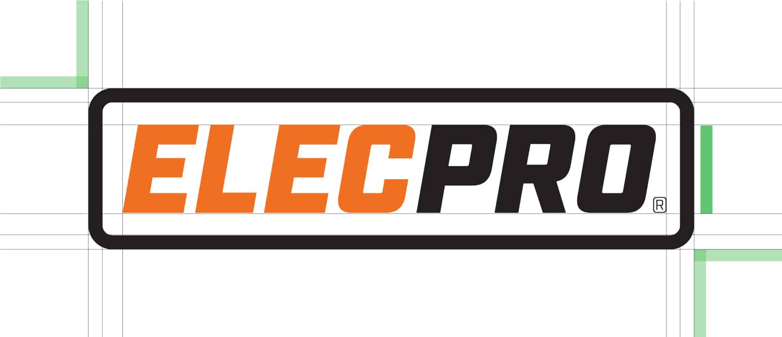
Logo
They knew that they wanted a simple wordmark for their logo that looked corporate and professional. The logo is geometrically designed and spaced to look like it was designed for a corporate chain. The logo is strong, can be read easily at all sizes and defiantly stands out. The wordmark is also leaning forward, hinting at speed and action.
Colours
We went with a simple 2 colour brand. Orange is an energetic colour that makes us feel a sense of confidence and success and black gives us sophistication, formality and security.
Primary Colours
Fonts
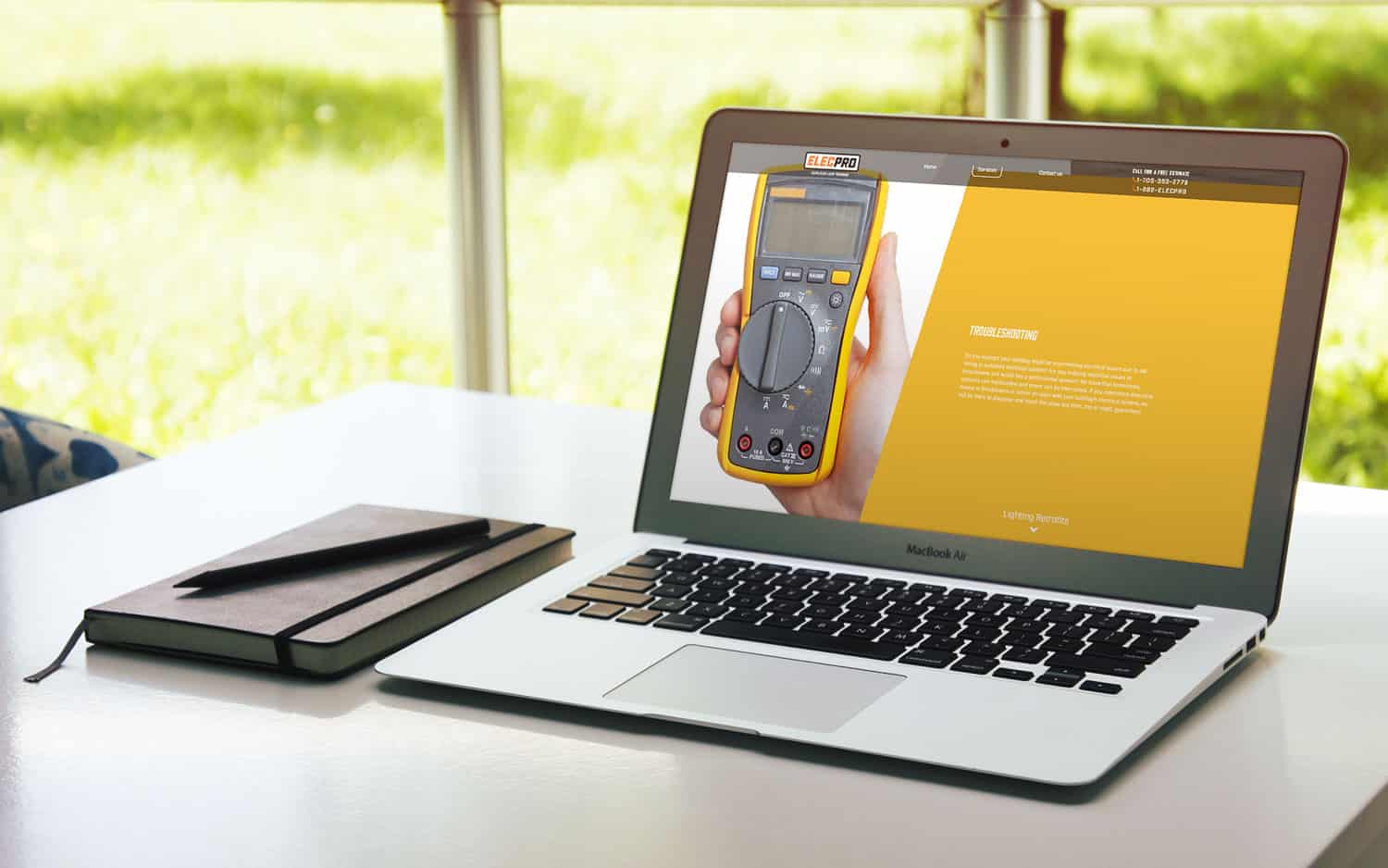
We needed fonts that work well in both print media and web design. The font “Industry” was used for headings because of its bold nature and similarity to the logo. Roboto works well for its versatile nature. It works well for body copy and compliments the heading font well.
02
Website Design
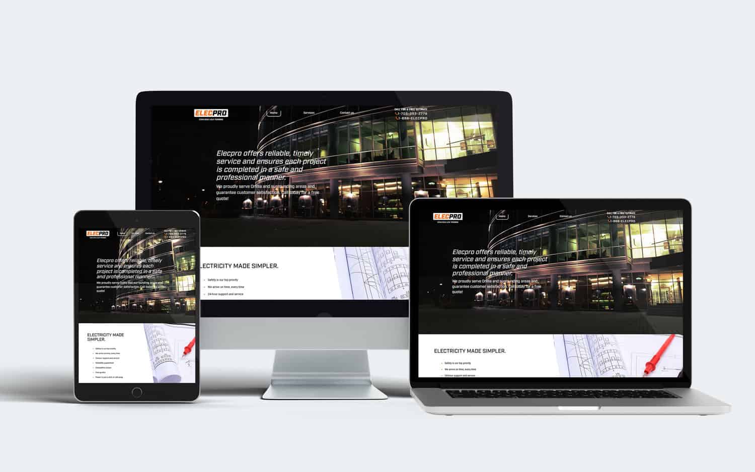
Website Design
The simple website was designed to speak to a corporate client and instill trust and confidence. From a design perspective, the photographic and textual content areas are split using angles that match the lean of the wordmark.