Dan Sawatsky was a local accountant. We wanted Dan Sawatsky’s firm to look like the top accounting firm in the area, attracting his ideal clients. We achieved this by crafting a new visual identity, improving his messaging and building him a new website.
01
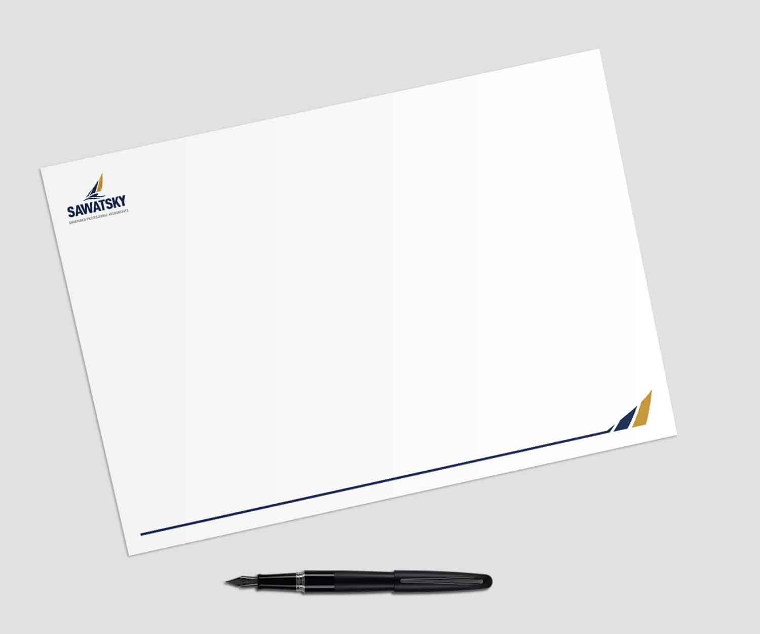
Branding
Logo
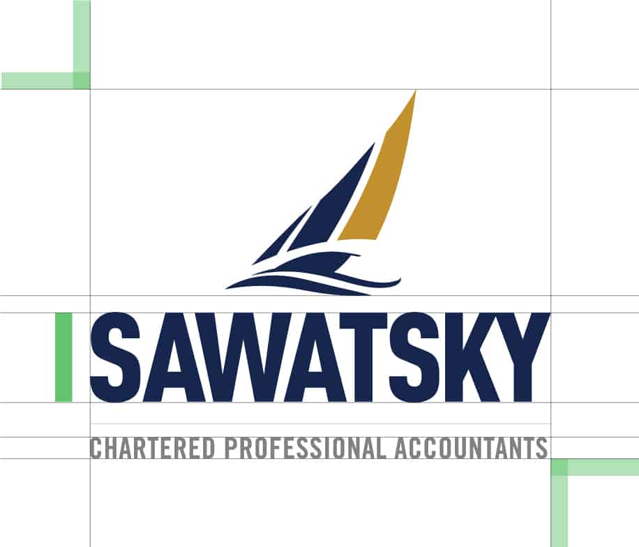
Growth, Progression, Wealth, Knowledge, Trust, Integrity and Strength… To some, it might appear as an abstract shape, to others it might resemble a stylized bar chart, but to most, it’s a sailboat. An iconic graphic that through market analysis and strategy research has been determined to be an ideal goal or dream of the targeted audience (clients). Presented through a sharp, clean, almost organic brushstroke, the sails are being lightly fluffed by the wind which pushes the ‘bar chart’ like a sail from the left to right and across your page creating a sense of movement. The idea of motion is something a Sawatsky client would expect to see. We all understand that finances can be a rolling and rough sea at times. Here we are presenting a calming sail on the sea of your finances showing that you are in control and ahead of the storm, or the idea of affluence associated with owning that sailboat you’ve always dreamt of having. The calm rolling wave creates a non-linear base for the wordmark to fall beneath and establishes a nice rule for the Wordmark to hang from.
Colours
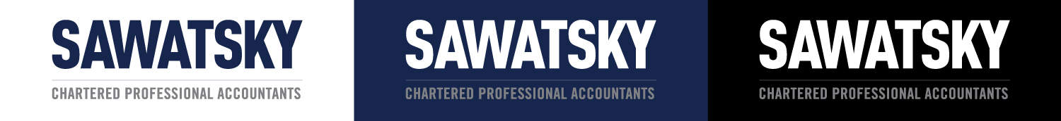
As a 3 colour brand; the blue, gold and grey combine to put forth a very knowledgeable, trustworthy and approachable brand personality. The shade and combinations of this particular blue and gold have been used because they demonstrate a great sense of royalty, legality and legitimacy. More specifically, the darker shade of blue represents the formality and professionalism of the accounting business presenting a more serious feel essential to the strategy of the brand. The gold, a deep and rich shade, brings forth the ideas of royalty, knowledge, growth, prosperity, and wealth. Grey, the third colour, works as a tertiary colour which is only to be used to create a formal balance between the logo and the tertiary ‘legal’ text.
Primary Colours
Fonts
This bold sans serif may seem simple at first glance, but its personality subliminally says a lot to a viewer without having read the name or the text that falls below it.
The purpose of the custom design was to provide the intended character of the brand and work with similar fonts used in other aspects of the brand. Designed for ultimate scalability, readability and overall feel this Wordmark really expresses the essence of ‘SAWATSKY’ as a brand, a company, and a group of friendly yet thorough accountants.
02
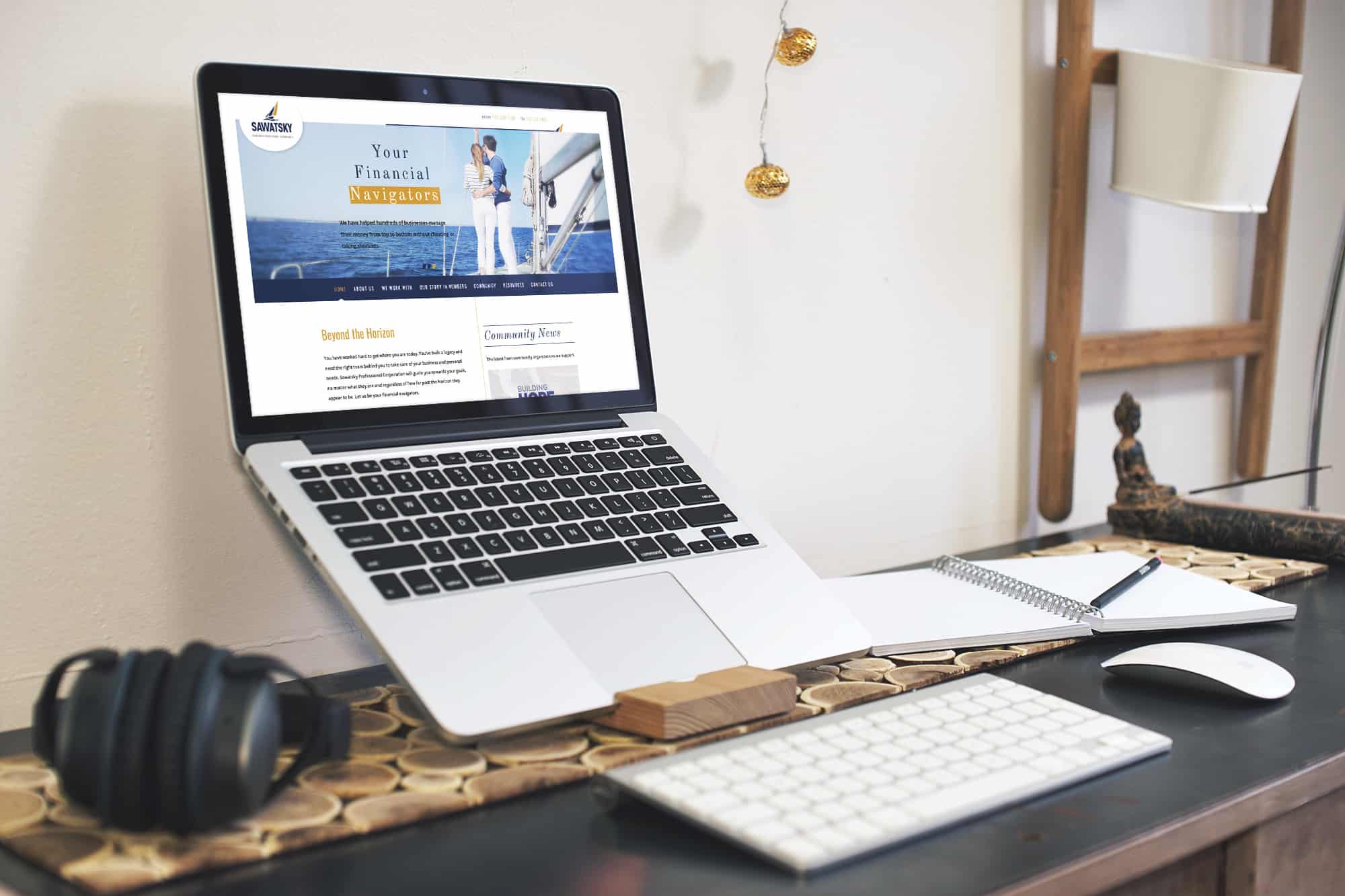
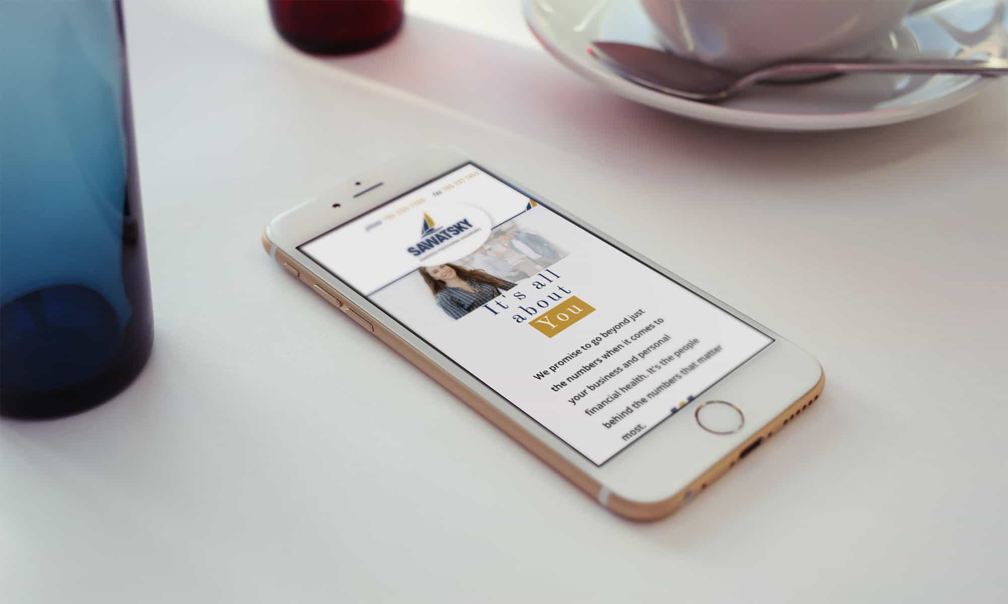
Website Design
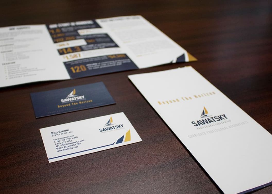
Website Design
The website is where the messaging and the brand identity come together to speak to the company’s target customers. Since launching, the company has continually been able to grow their business by servicing customers that have contacted them through the website. It is a powerful case study that speaks to the power of a professional brand that looks good and says the right things.