W.S. Safety is a supplier and installer of Rooftop Safety systems like guardrails, safety lines and other industrial rooftop safety products on large buildings so that workers don’t fall off get hurt and/or sue the pants off of the owners.
When they came to us, they had realized that their website was out of date and they were looking for us to improve the look, making it look more modern and improve their rankings in the search engines. They were also concerned about the security of the site since it hadn’t been updated in a while. (We realized it had been hacked a bunch of times when we started working with it and many of their google rankings were directing people to Russian websites.)
They had worked with an agency from the city to build their website, search engine optimization and Google Pay per click ads with mediocre results.
They wanted to not only increase sales but also increase brand awareness and become a nationally recognized leader in the industry.
We convinced them that in order to get these results they needed to step back and look at their company brand and online presence as a whole (not just redo their website) and then worked through our Discover > Strategize > Design/Build > Review & Improve process with them.
After some Discovery, we developed a Brand Strategy and a comprehensive strategy for the website that included design, programming, SEO, and a conversion strategy.
We then rebuilt the website to match the new brand and implement the on-page SEO strategies with fantastic results in the search engines. On an ongoing basis, we are managing their Google Pay Per Click Campaigns, doing ongoing SEO in the form of writing keyword-rich articles that focus on specific searches and manage their social media profiles so that they are sharing important industry-related information and the content that we write.
01
Branding
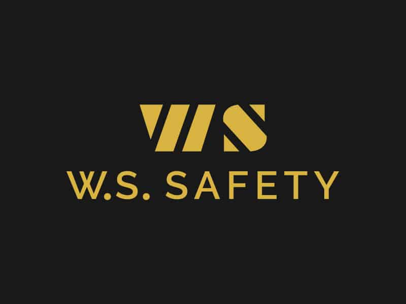
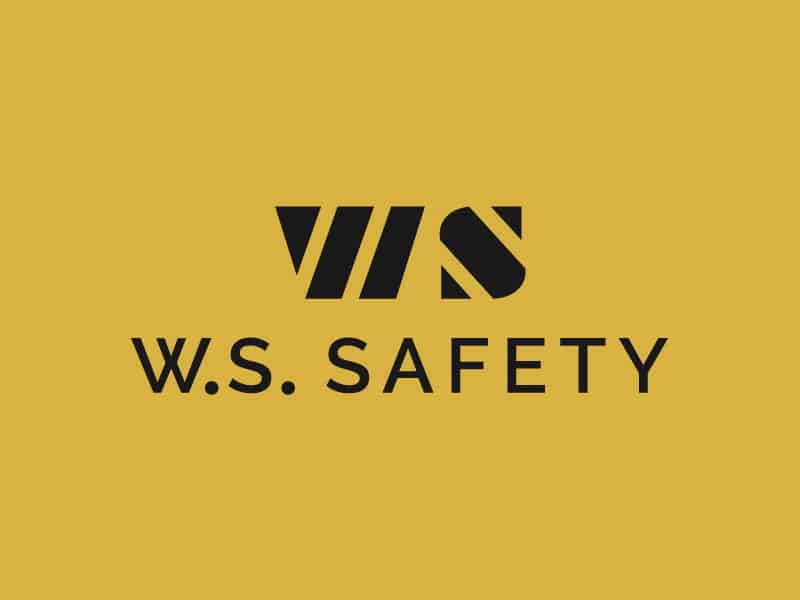
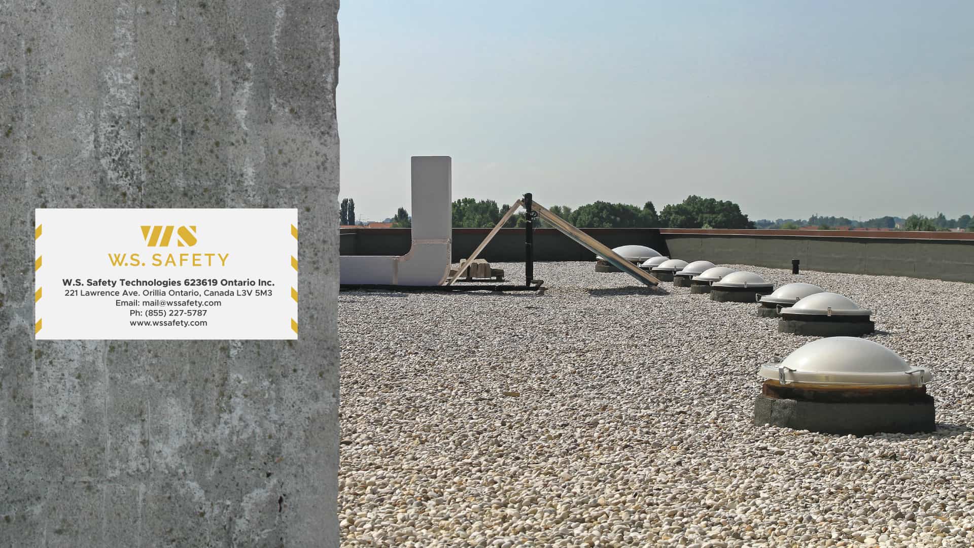
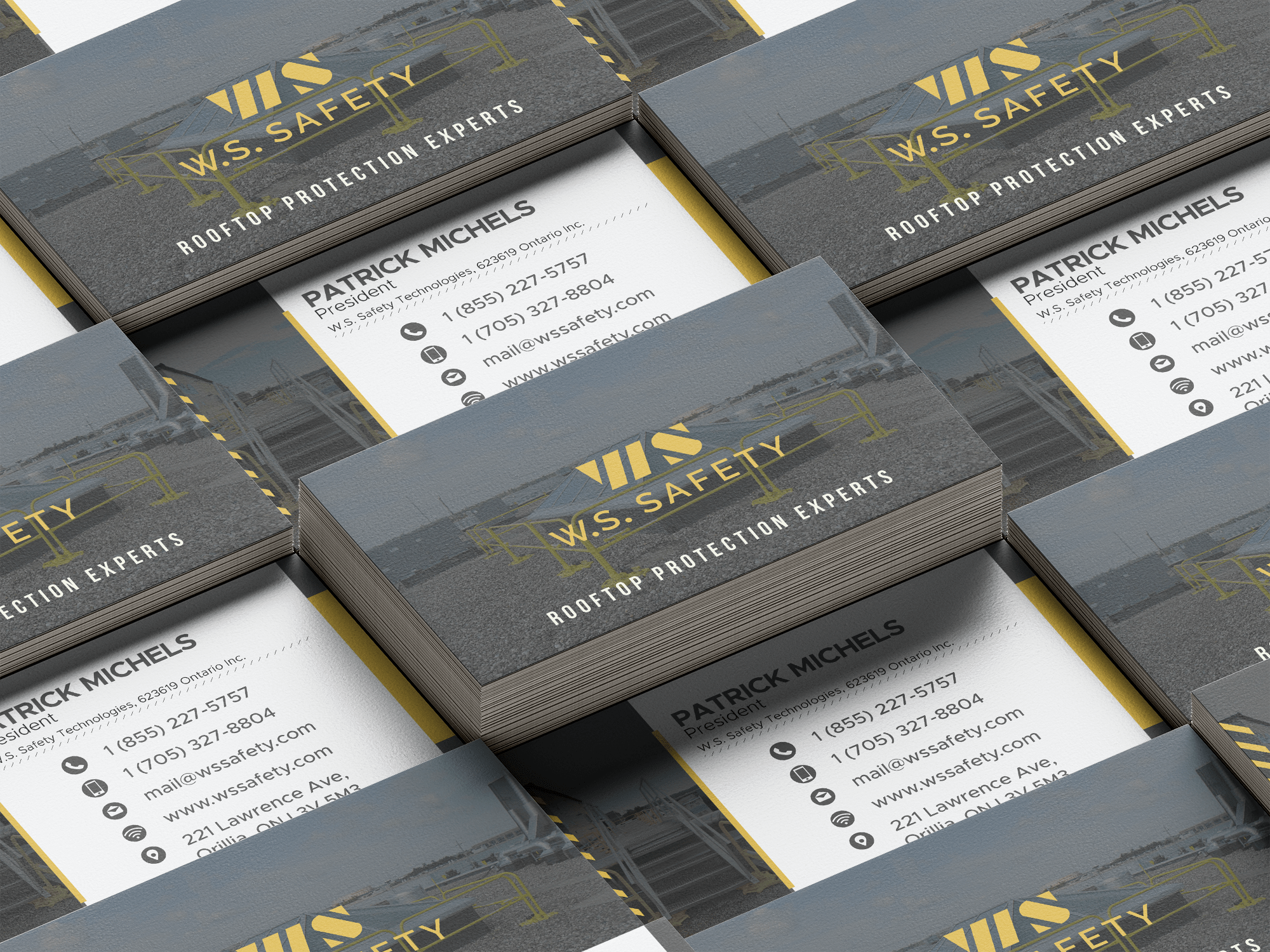
Logo
Since W.S. Safety is built on keeping people safe around rooftops, we decided this should have a bit of a construction look to it. It should make people think of safety and make people feel confident using their products and services. We used the “WS” as the icon and made it out of stripes to make it look like caution tape. And then we used a respectable font to bring it all together.
Colours
Yellow and black remind people of safety and construction. The black is an actual “soft black”. It’s a little lighter than pure black, which gives it a softer, more approachable feel. The Yellow is mustard yellow. Pure yellow is too harsh and hard to create a good contrast. This mustard yellow combines well with the soft black. To add to this brand we used a set of secondary colours to help expand on the brand. These complement the main colours and give the entire brand more flavour.
Primary Colours
Secondary Colours
Fonts
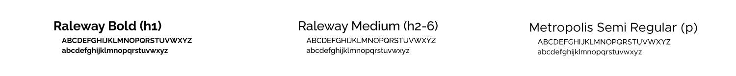
We used a very elegant font for the main heading font. Raleway is very versatile and works well as the main headings font. We used Metropolis as the body copy due to its modern appearance. It works well combined with the heading fonts.
02
Website Design
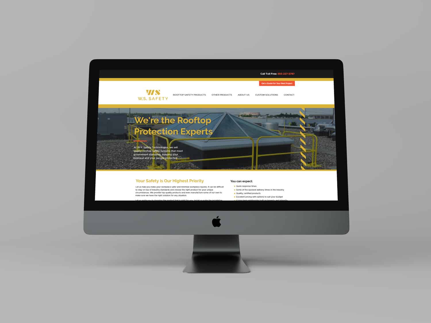
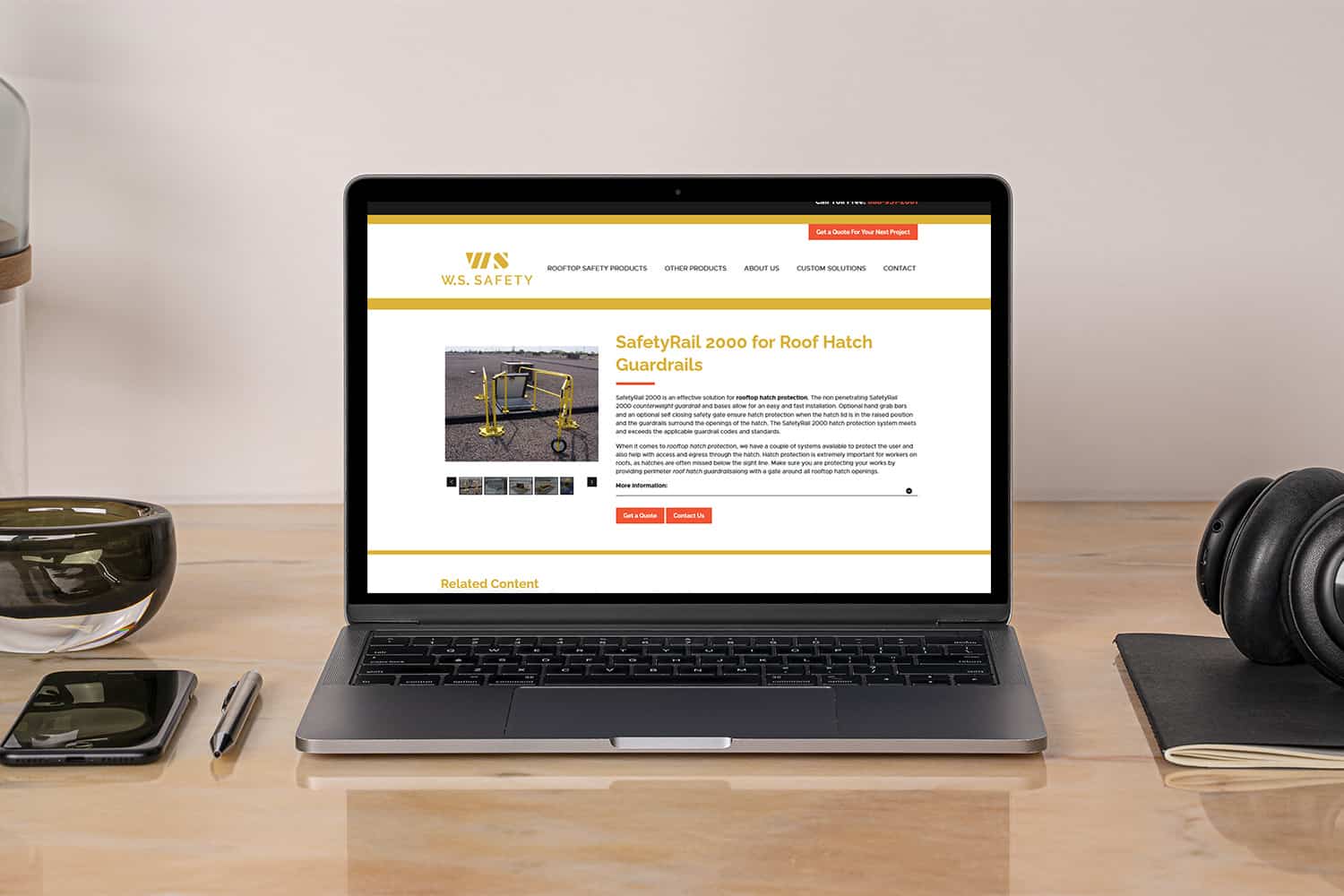
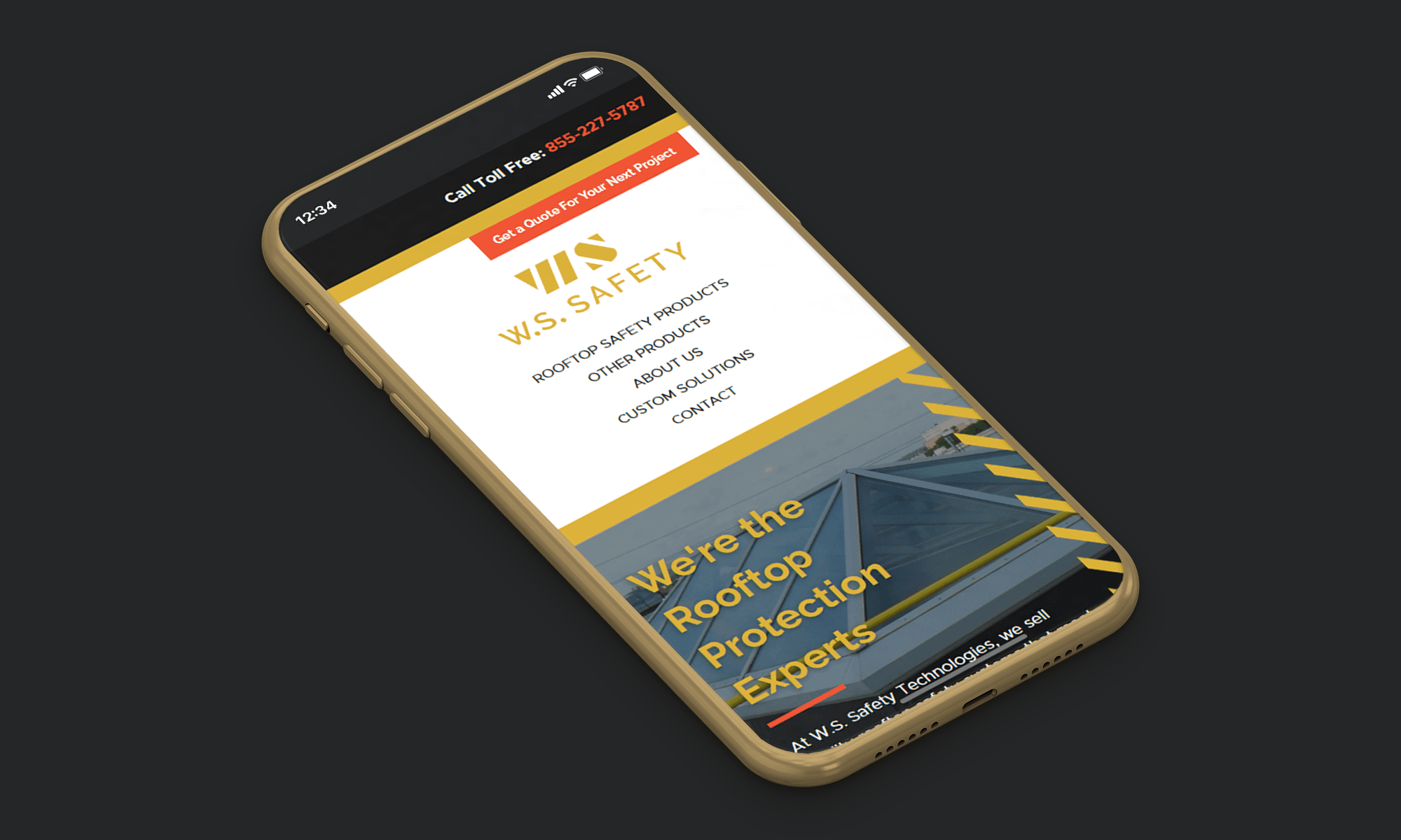
Website Design
The website brings all the brand elements together. It was designed to give the user all of the information they need in order to make an educated decision on their rooftop safety materials and quickly convince them that W.S. Safety is going to help them reach their goals. The majority of its users are business owners and managers. This site needed to be functional and professional at its core. We didn’t need to be extra flashy or have any gimmicks. We wanted to create a simple experience that generates leads. Let’s just say this investment has paid itself off MANY times over!