To make the brand look more professional and more modern, positioning the company in a positive light to begin to win larger contracts with bigger industry players.
01
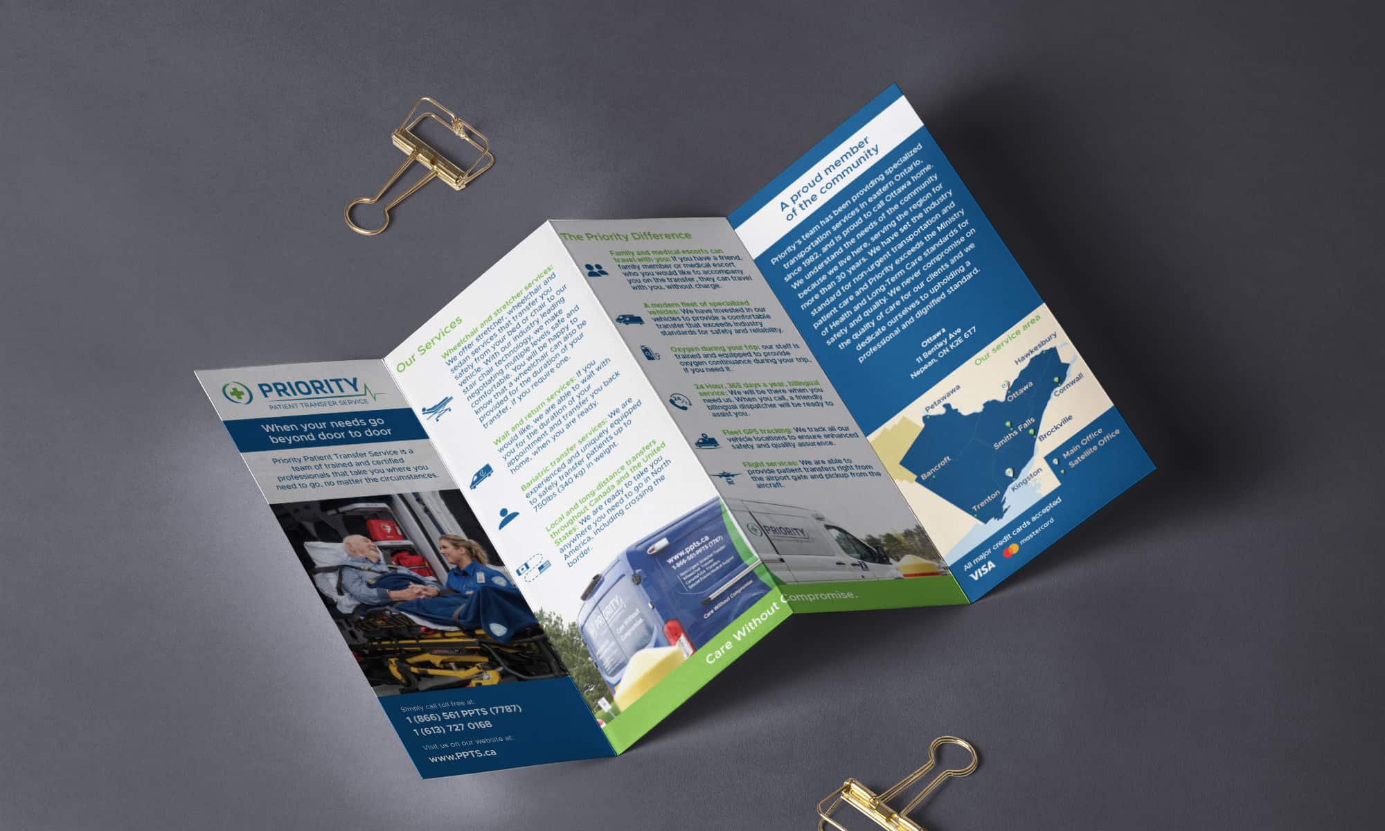
Branding
Logo
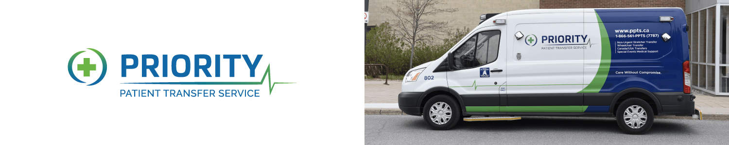
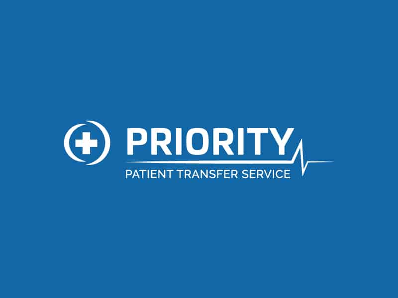
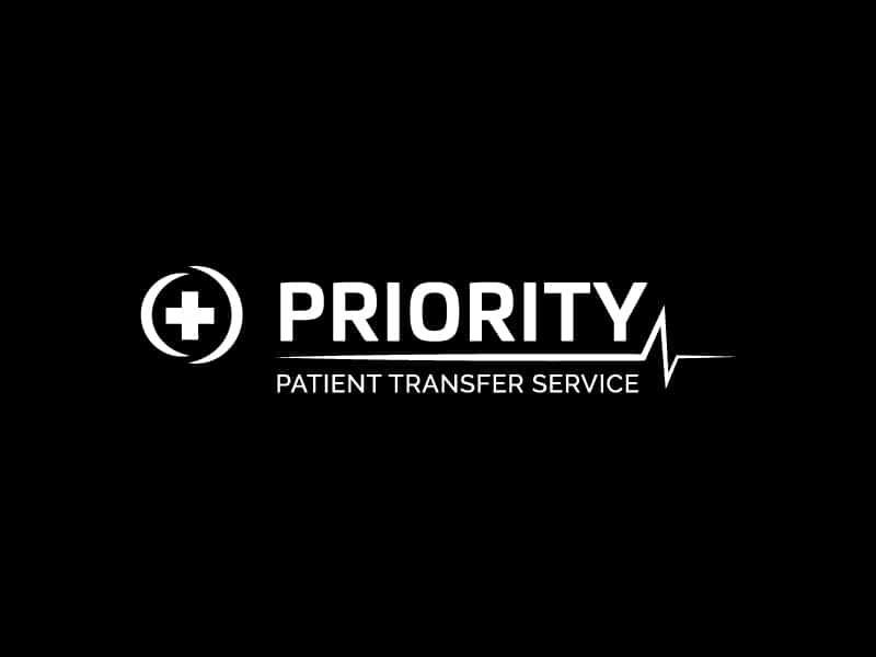
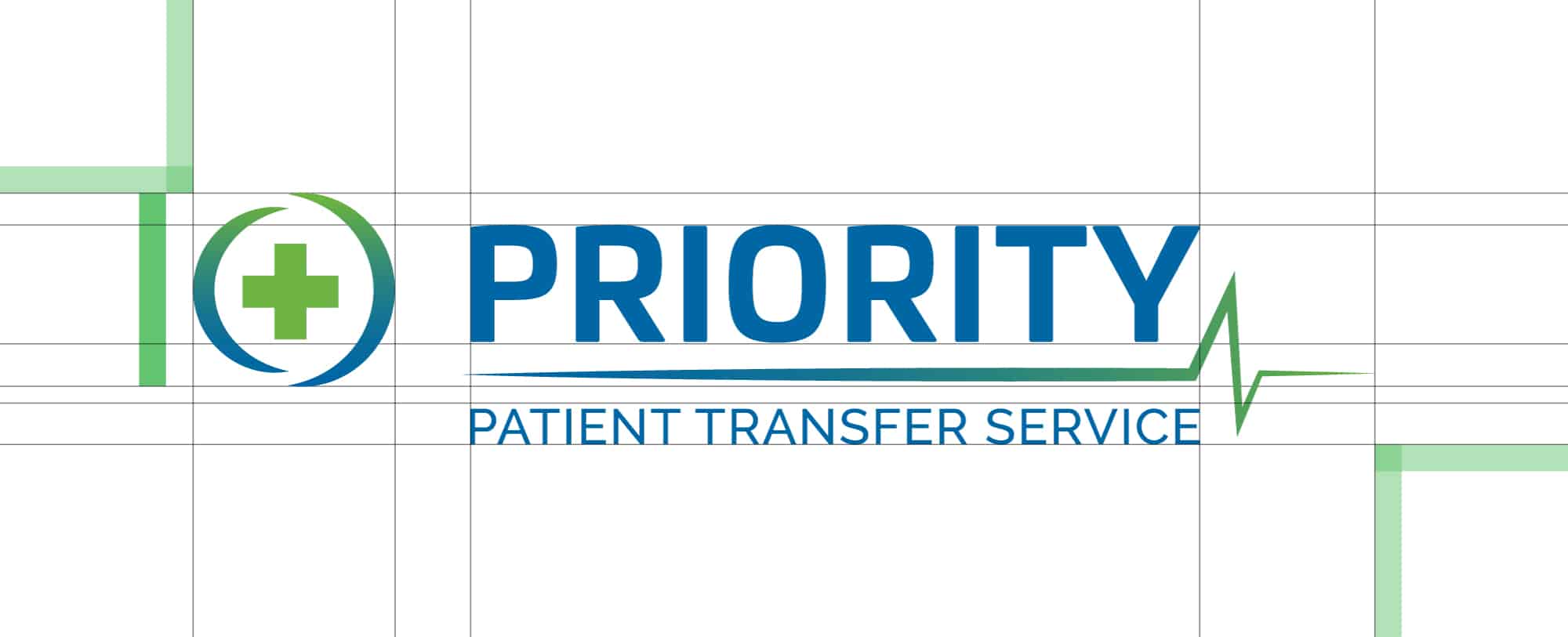
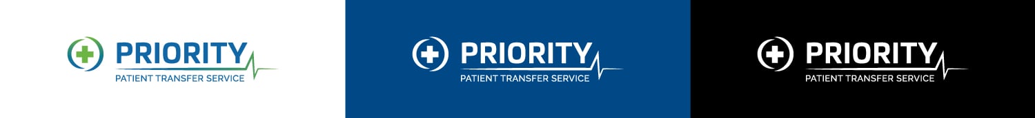
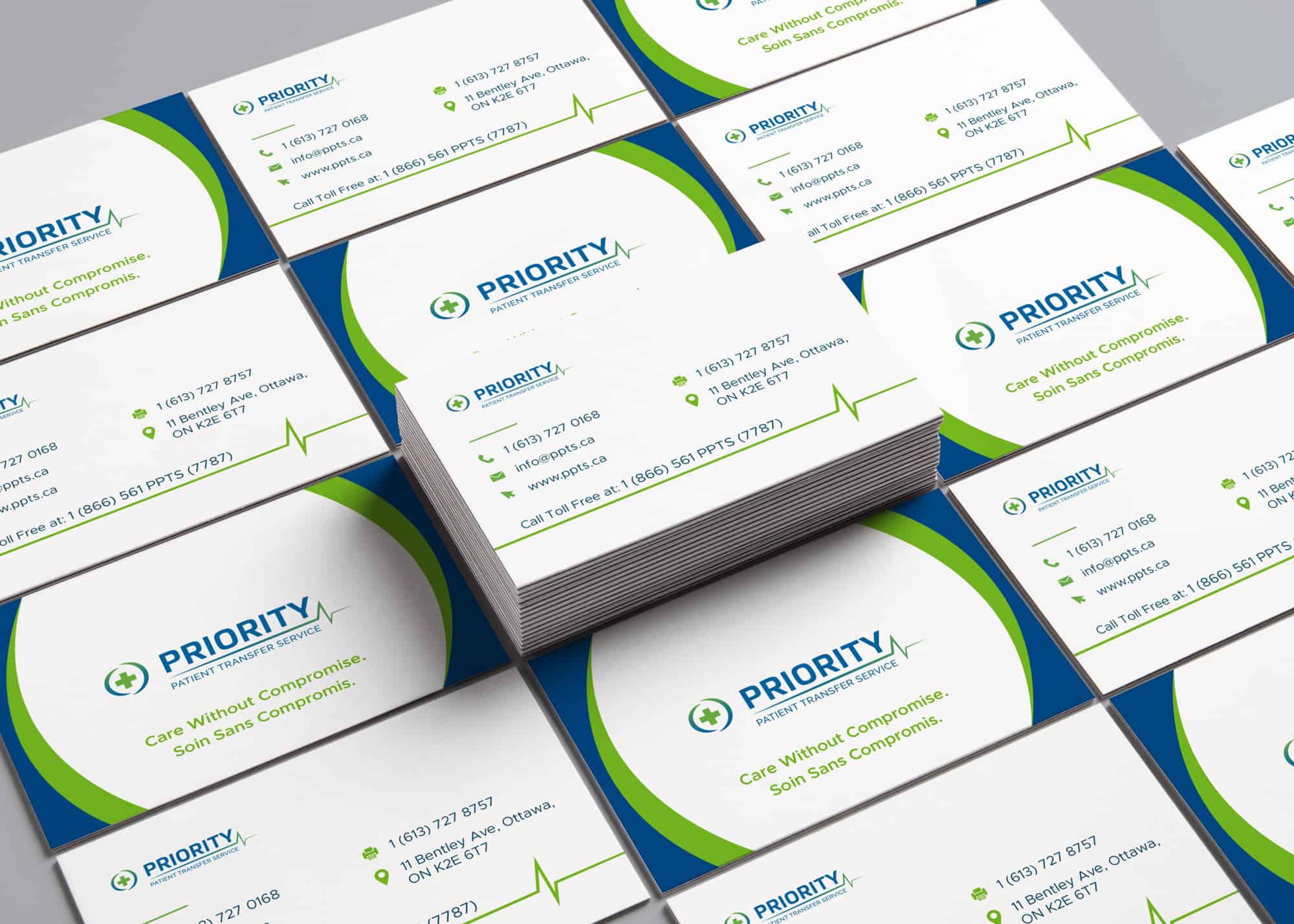
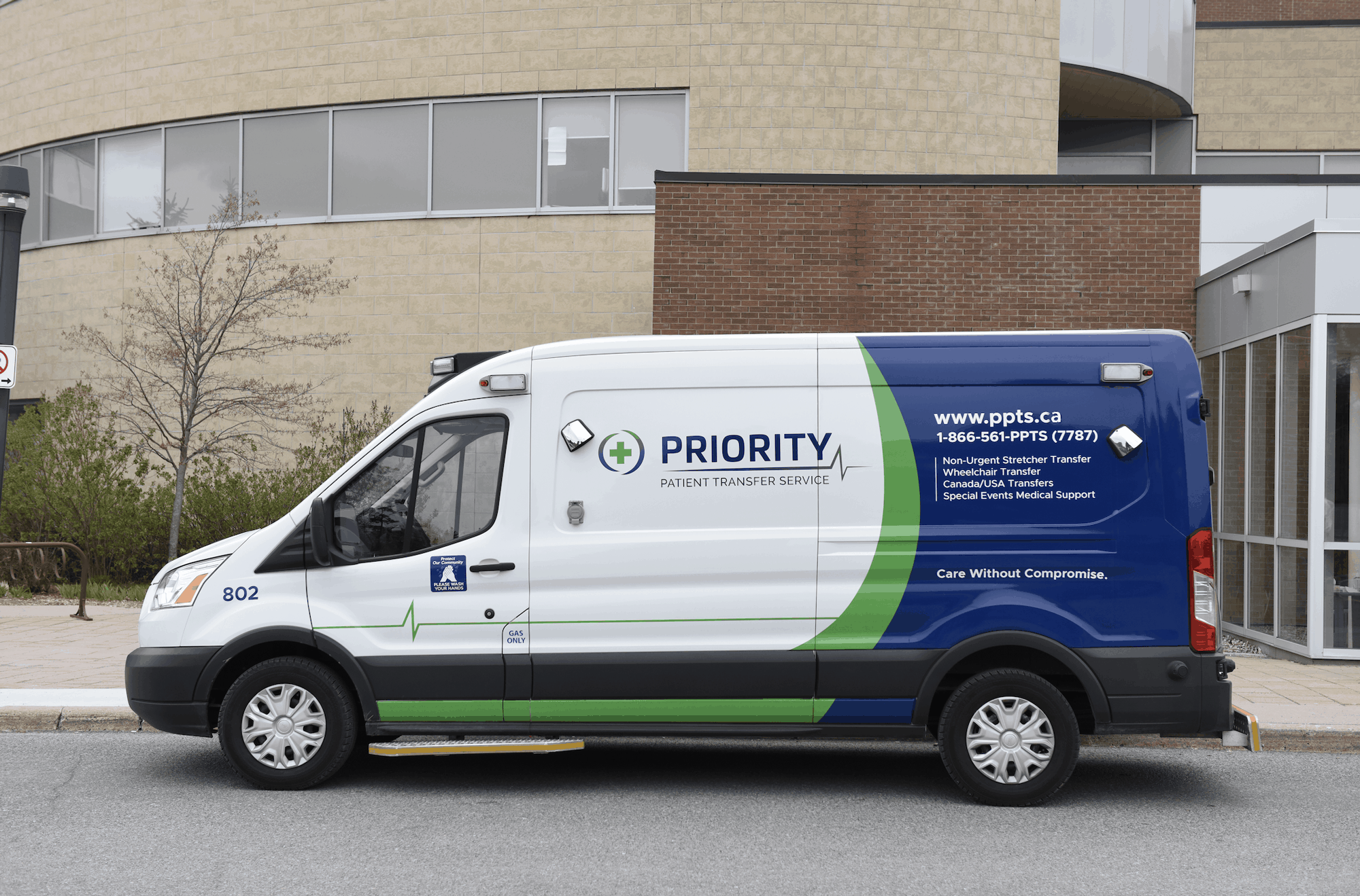
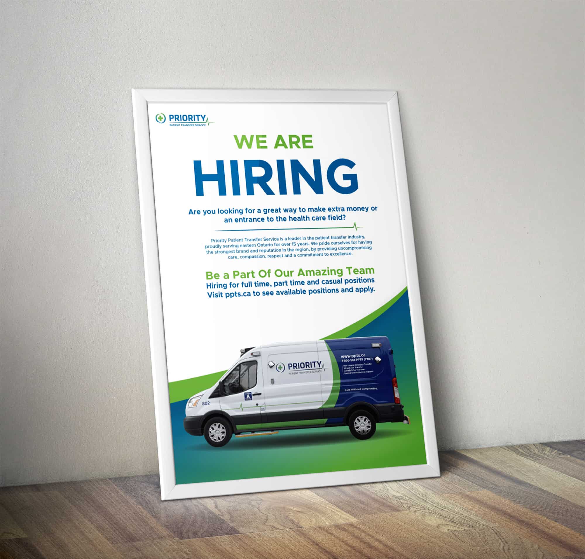
We were updating an existing logo and tried to keep some of the same spirit and elements. We tried to find a good balance between the plus in the circle and the words. The circle elements around the cross are made to resemble the wheel of one of their transport vans, representing medical transportation in an abstract way. We provided a flat variation to be used then the gradient variation can’t.
Colours
Blue and Green are complementary colours that both represent cleanliness and the environment. Blue feels confident and dependable. This colour scheme had already been established before we did the rebrand. We chose an official blue and green that look modern and compliment each other.
Primary Colours
Fonts
We needed a font that was clean, modern and worked in a variety of different situations. From vehicle wraps to web design. Metropolis was the clear choice. A nice sans serif font that provides a lot of variation between font weights. It allows the brand to use the font in different scenarios to best suit the situation. It’s a strong font that also isn’t overly common so it stands out and is unique to PPTS.