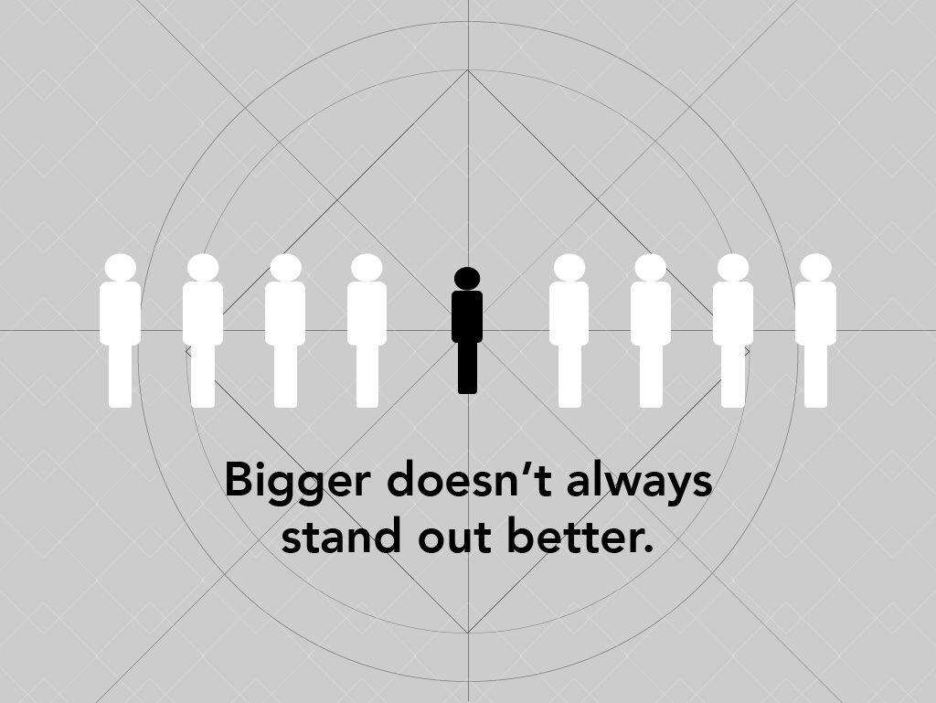
It’s a request we hear very often whether it be on your website, a business card or an advertisement. We understand, you want your brand to stand out and be memorable – for it to shout out to your clients “this is who we are”.
You love your logo, we might have even designed it for you so chances are, we love it too. We just don’t think that making it bigger is always the right answer and here are our reasons why.
White space is a good really great thing!
I am an extreme minimalist by nature so this concept comes naturally to me. Less is more. Especially when it comes to design, or my house.
In design terms, white space is the space between graphics, columns, images, text, margins and other elements. More white space makes a page easier to read, and easier to direct people toward the action you want them to take.
White space will actually help your logo to stand out, rather than making the logo bigger. White space is like taking a deep breath, it clears the page and allows the reader to relax; it makes them more receptive to your message and it’s just a lot easier to read. Especially around your logo, white space will give it more visual prominence, rather than making it bigger.
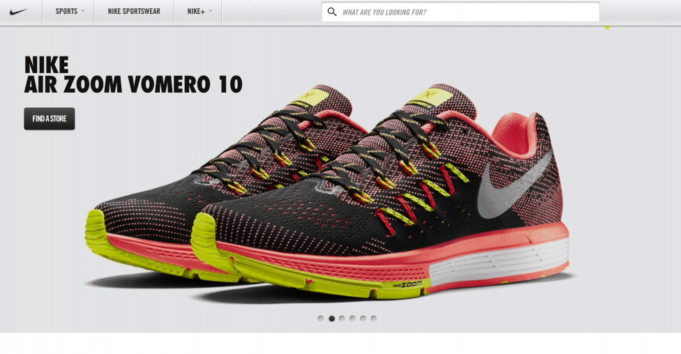
Blank space reminds us that simpler is more effective and that we don’t need to create a design filled with text and graphics to deliver a clear and direct message. My favourite example of this is Nike. Their homepage is filled with whitespace so you can focus on what they want you to do: buy shoes.
You don’t want to make your designer mad by upsetting the balance of his design.
Ok, I’m kidding here. Well, at least the part about making the designer mad, upsetting the balance of the design is legitimate. Once you’ve sent your designer all of the content, copy, graphics etc., he or she will spend a lot of time perfecting the balance, visual harmony, and finding that elusive “sexy”. Yes, that’s actually a term that I hear our designers use about designs on a regular basis.
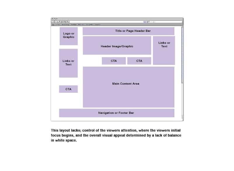
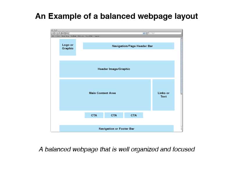
Whether you realize it or not, your eyes are drawn to symmetry and balance. Making one element on the page larger could throw out the balance and make the overall design less pleasing to the eye.
A communication piece that is not balanced is harder to read. The natural movement our eye uses when scanning a page may be interrupted, which means your message may not get through as effectively.
You want to control where your reader’s eyes are directed.
So now that you understand that balance in design is very important you’ll understand that with the right balance, the reader’s eyes scan the page and settle on the element of the design given the most prominence.
The designer has planned out where the reader’s eyes should be “directed”. If the wrong element on the page is displayed most prominently, the reader may dwell in the wrong place and ignore the important information, or CTA (call to action) of the piece completely.
You have very little time to communicate a message before you lose a reader’s attention. Three seconds on a home page to be exact. Directing the eyes using balance in the design is a great way to maximize the chances of communicating the message effectively.
Why are you shouting at me?
We all like to believe that our customers love our brand. They probably do, but making your logo bigger won’t make them love you more, in fact, it might even look like you are shouting your brand at them. Also, making your logo bigger can send a range of other messages to your customers. The bigger your logo (and the more cluttered your design is), the more insecure your company looks.
The logo, photography style, tone-of-voice, colours and typography, all come together to create your visual brand. The sum of these elements is much more powerful in communicating your brand than the size of your logo alone.
If these elements are consistent across all of your companies touch points, you will shout “this is who we are” more loudly than a larger logo.
Still not convinced?
We want your design piece to be successful. Whatever the piece and whatever your goal is for the piece we want to help you achieve that goal. You only have a few seconds before you lose the attention of the reader, let us help you guide that attention where it is supposed to go.
If you’re still not convinced, here’s a product that you can buy that will help you out 😉

